Mapping a million new sister cities
- Sister cities/city twinning fosters explicit international camaraderie
- Implicit international camaraderie (an encyclopedia editor edits 2 pages) is abundant
- Over a million places in Wikipedia have mappable coordinates
- See on a live map: 1M points, 0.5M labels, 20M edges, autocompleting search box
- It runs fast from static files on a GPU with binary in-place data structures (Arrow, SQLite)
In action:
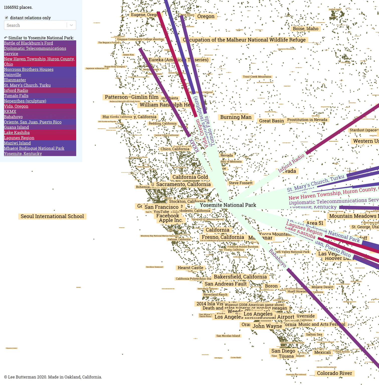
Looking at all of the places twinned to Yosemite National Park:
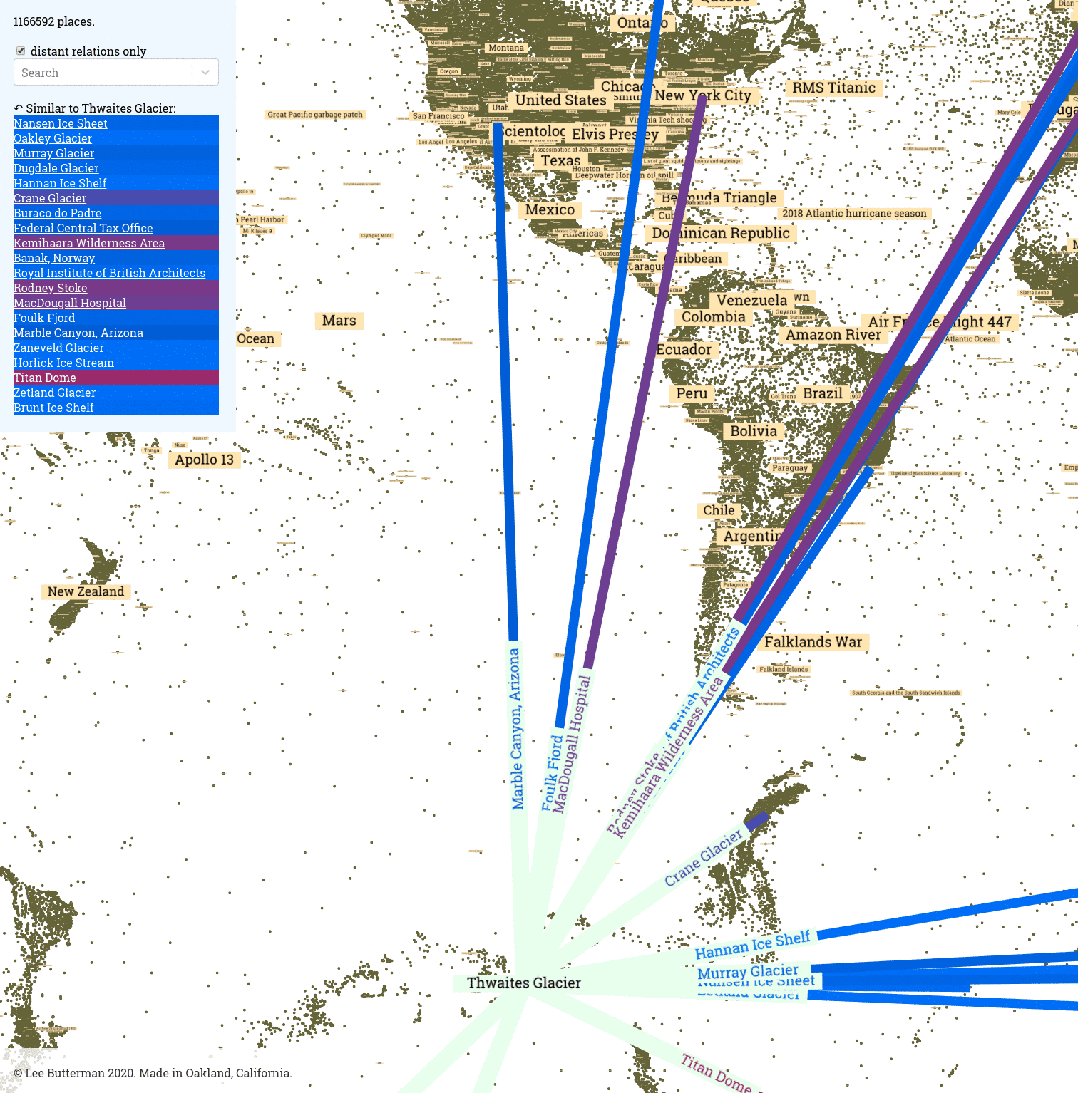
At all the places twinned to the Thwaites Glacier:
Autocomplete is helpful for text-only navigation:
And at 15 frames per second, the tan labels smoothly resize and the olive points merge into solid land masses with familiar shapes and are easily highlighted to reveal more:
Paradiplomacy, in bulk
The idea of sister cities / twin towns has existed for a long time, and has grown dramatically since the end of World War 2. Establishing relationships through city twinning helps build international ties: this can promote understanding, this can strengthen shared community (student exchanges, and more) and economic development. Promoting solidarity and interdependence can assist official diplomatic channels, and stronger diplomatic ties strengthen international peace, especially between hostile governments.
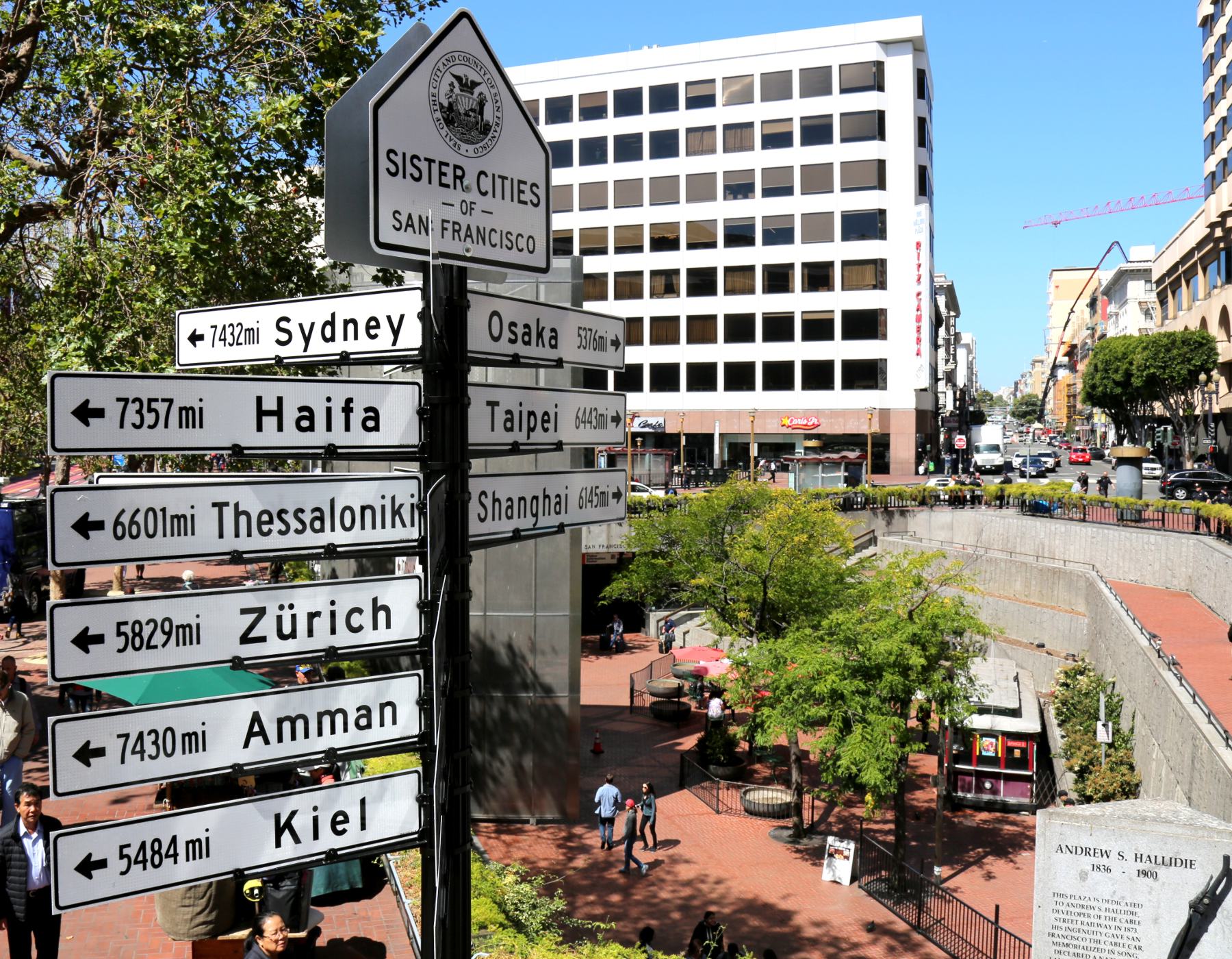
These ties are usually explicitly arranged, and binary: a city either appears on a ceremonial signpost, or does not, like here in San Francisco, in this SFDPW photo:
Interestingly, the plaque to Osaka is still up in 2020, even though Osaka pulled out from its side of the relationship after sixty years. This implies that the siblinghood of cities is not binary, like presence or absence of a sign, but exists in shades of grey, and derives from implicit connections (of which the explicit signage is a point-in-time formalization of surpassing some threshold), and feelings of kinship have always transcended the imaginations of municipal decrees.
One way of measuring these implicit connections is via shared awareness: shared friend groups between places, or shared taste, or shared cultural projects. One shared cultural project is Wikipedia, edited globally, which gives a liberating side-effect: there are over a million places in Wikipedia with coordinates, and many more types of places are available for twinning: individual neighborhoods, train stations, parks, human gatherings and events, art installations, and so much more.
Wikipedia data is easy to access and easy to parse, but it is not a perfect reflection of global human sentiment. The dataset has biases like the demographic of its editors, their background knowledge, their contributions, their ideas of the requisite notability of a place for inclusion in the encyclopedia, and more. Compensating for this bias is challenging, and seems larger than a quick data cleaning step. Useful directions might include different datasets (Wikidata? Common Crawl? Social network checkin data?) or different weighting strategies for editors based on behavior analysis, and suggestions are welcomed.
After extracting from the raw data a list of who edited what when, and before loading it into a map, we need to transform it into the top N most similar places, for a given place. We can cheaply compute similarities of editorship between two pages, and we can weight individual contributions to reward dedication to a topic and penalize editors who broadly contribute to many different pages (like link-fixing bots).
Cosine similarities of pages, based on editors, tf-idf-weighted
Computing item-to-item similarities is so well-established and such a tried-and-true practice that Amazon’s patent on it has expired. The basic idea, for four items and two contributors, is that one can imagine the x dimension is one contribor’s impact and the y dimension is another’s, and if their contributions look roughly like:

then it is possible to say that the red and blue items are very similar to each other, because even though their sizes are different they point in very similar directions, which implies the contributors’ impacts on them are similar, and similarly for the green and grey arrows.
The dot product of two vectors, a · b, is defined as the product of the length of each and the cosine of the angle between them. It represents an application of one vector’s direction onto another: the dot product a · a is the length of a multiplied by itself and the cosine of the zero angle between a vector and itself, which is one, and this checks out, because the square of the length of a is the sum of the square of each component. We are interested in the angle between any two vectors. If we pre-normalize the length of each vector to 1, then their dot product is just the cosine of the angle between them.
The convenience of the dot product comes at computation time: it is computed as the sum of the pairwise products for each dimension of the vector. If we assume that only a few contributors have impacted each page, most of those products in the sum will be zero (because not both of the contributors have contributed to the item). Further, if we can skip multiplying zeros and adding zeros, we can achieve significant computational savings.
Scaling this up to the dataset of Wikipedia, with a million items, several million dimensions (one for each editor), and tens of millions of contributions, computing all several-million-dimensional dot products between each of the million items and every other of the million items takes only a few hours.
Further, each contribution is not equal to each other, and each contributor is not equal to each other: someone who edits a dozen pages hundreds of times and edits a few other pages a few times should contribute a strong signal for those dozen pages, and a stronger signal overall than a bot that has fixed one or two broken links on hundreds of thousands of pages. One way of representing this lopsidedness is by augmenting the weight of one contributor’s contribution to an item by the frequency of how much a contributor has contributed to that item, and by the inverse of how much that contributor has contributed overall. The inverse of total contributions is an idea from Karen Spärck Jones, and is more of a heuristic than an exact science.
Data pipeline
The entire edit history of Wikipedia is downloadable as XML, and the English language version is currently 19 years old. This XML is straightforward to parse each revision into line-separated JSON objects. You can parse the entire edit history, with or without the text of the articles (the pages-meta-history or the stub-meta-history). You can also parse just the current page text (the pages-articles), which as of January 2020 is only 16GB compressed. Extract, transform, and load all of the XML into an enumeration of pages and an enumeration of revisions, weight each revision based on tfidf, and compute n² similarities (but with enough indexing of the sparsity to keep the runtime well below quadratic, and enough pruning of top-n results during computation to keep storage requirements constant and predictable).
The whole pipeline to compute correlations takes under a day to fetch and parse the XML on a residential internet connection and commodity laptop from 2018, and a few hours to run through the tens of millions of revisions and pack up a list of places and a list of similar places to be viewed:
- in parallel, fetch and parse the shards of the edit history (the stubbed meta history) since 2001
- in parallel, fetch and parse the shards of the current articles, and extract coordinates for each page
- make a histogram of how many times each page with coordinates is edited, and use that to re-id each page
- write out the (longitude, latitude, title) tuples for each page to an Arrow file
- insert each title and corresponding id to a content-free SQLite full text search index
- count up all of the unique user-id/user-name/user-ip edits to a page, and add each count to a page×user sparse matrix: this is the term frequency
- compute the number of different pages each user has edited, and exponentially devalue prolific contributors (2048 pages=1, 4096 pages=0.55, 8192 pages=0.005, 16384 pages=2×10-13) to devalue bots: this takes out a quarter of the edits
- compute the top twenty related pages for each page, one at a time, and write out twenty Arrow files
- compute the top twenty related pages for each page over 500km from each other, one at a time, and write out twenty Arrow files
The map loads from a collection of static Javascript and the SQLite database and the 1+20+20 Arrow files.
Map implementation
The implementation of the map of places and their kindred places is a single-page Javascript app that runs from flat files that uses a few off-the-shelf components.
.arrow as data interchange format
The data loads in as Arrow buffers, densely-packed column-oriented tables. These Arrow files, roughly, attach names to columns in a data frame, and these columns are mostly encoded as arrays in slabs of memory, with one value written out after another like in a memory representation of a C float[], a Javascript Float32Array, on a GPU. There is no parsing step, in general, and data in the format is designed to be used in-place in Numpy/Pandas/Python, in Javascript, in compute shaders.
As soon as the browser receives the Arrow table of places, it can wrap a Float32Array view around the part of the buffer that represents a column of latitudes, and immediately start reading them in-place. As soon as the browser receive a column of similarities, it can wrap a Uint32Array view around that part of the buffer, and immediately start reading the integers therein. Compare that to reading in a million floating point numbers represented as ASCII base 10 numbers, with no size information, and parsing that into an array, forty times.
deck.gl as visualization layer
For a map, we’ll want points, we’ll want text, we’ll want lines, we’ll want the map to move when a mouse drags it, we’ll want the map to understand what is under a mouse hover, and we’ll probably want a search box and arbitrary other items. deck.gl is highly flexible, and accelerates most of the runtime computation of pixels and hovers onto a GPU, and deck-gl-react helps with usage in a small React app. The map has several layers:
- one circle for every point in the dataset
- one text label for the first 100k/500k points
- at most one active place, either clicked or hovered
- a starburst of lines and text in each point’s direction for each twinned place
- the list of twinned places, in order of degree past the origin, on the top left
- a search box + autocomplete
The text layer is flexible enough to support line-breaking, which is very convenient when necessary, but the line-breaking happens on layer creation in a single Javascript thread, so (because we want to arbitrarily size strings) we need to limit the number of text strings we display by default to 100k, extensible (via checkbox and popup confirmation) to 500k.
After we have rendered the million points and the half million place names with appropriate sizing, we can easily get above 15 fps during zooming and during mouse highlighting on even a two-year-old computer with a four-year-old graphics card. (A new graphics card with newer architecture and twice as many cores should improve performance to 30 fps.)
100k points of interest
All points display their titles on hover, but we want to see some titles even without scrubbing the graph. Choosing points of interest automatically is a hard problem, but we can use number of revisions for a place’s page as a proxy of how interesting a place is. This overemphasizes disaster sites, and more work is needed in this domain.
Additionally, not only do we want to emphasize interesting places, but we want to avoid overemphasizing places in dense cities. This is even more of an art than a science, and more work is needed in this domain. Specifically, the balance of different sized text at different zoom levels would probably be more intricate logic than purely setting the right size in an off-the-shelf deck.gl text layer.
The way we are sizing points here is, roughly, proportional to the number of revisions, decaying sublinearly, and proportional to the surrounding density and rank by revision count therein, where the surrounding density is measured in squares of equal number of degrees in latitude and longitude over the entire globe.
This is currently running in Javascript, on load, but is highly parallelizable and does not require exact rank calculations (especially after the beginning ranks per square, where most text will be small, so slight re-ordering is acceptable), and this sizing computation could be rewritten to use the GPU.
SQLite as autocomplete backend
We have over a million places, and these are fun to explore by name, so some sort of prebuilt full text search index seems necessary. The full text search query support in SQLite is flexible, performant, and rock-solid. Compressed, it adds about 360KB to the download footprint, and the search index weighs in at under 11MB. The queries on a single character take between 10 and 100ms to run, and two character queries that yield fewer results uniformly run in under 10ms.
We use react-select to drive the autocomplete search results and sql.js to drive the SQLite queries that find the ids of pages that match the query. We tokenize the search text like SQLite, and find all instances of tokens near each other: searching for “bridge broo” returns “Brooklyn Bridge” at the top, which is significantly more flexible than exact string matching. Further, we no longer need the autocomplete’s default behavior of filtering its provided options based on a string match, and this gives even faster performance.
Results
International Solidarity
It’s fascinating, and heartwarming, to see experience shared across the globe, to see Oakland, with its resplendent Lake Merritt right by downtown, twinned with two gorgeous lakes, Krishansar Lake around Kashmir and Lake Kuttara on Hokkaido, each pointing back to it. Or the diverse and brilliant East Oakland, home to Mills College and twenty minutes from UC Berkeley, with commonalities to both the Sorbonne and Tuskeegee University.
Or Point Reyes, with a significant Scottish presence (the town of Inverness on the peninsula was named as such by a Scottish landowner), and with a mutual similarity with Dalvay-by-the-Sea by Prince Edward Island in Canada.
Or Mono Lake, in the Great Basin, by Yosemite, just east of San Francisco, which shares bidirectional links to Nancy Holt(‘s Sun Tunnels), which shares bidirectional links to two works from another land artist Michael Heizer, Levitated Mass and Double Negative.
Interestingly, in the top 20 for Sun Tunnels there are no references to her husband Robert Smithson’s land art, the nearby Spiral Jetty, which shares bidirectional links to fellow land artist Walter De Maria’s Lightning Field, and to its owner the Dia Art Foundation.
Or the Aral Sea, linked to the Tod Reservoir in Australia, as well as historic rural places in the midwest and western USA.
Interestingly, Occupy Wall Street links with both Occupy Oakland and Occupy Portland, and Occupy Oakland links to two metro stations around Tehran, and Occupy Wall Street links to a Moscow metro station and a Moscow cathedral and to the USA defense contractor General Atomics!
Cartography
For areas with relatively higher densities of points per square kilometer (like Manhattan, San Francisco, et cetera), it is surprisingly usable to make a map purely with points and text sized by total discussion and density of neighbors. The sort-by-controversial and size-by-controversial-and/or-isolated in the map can give a good idea of the territory even when zoomed far in. The appearance is similar to a tag cloud, and zooming in helps focus the eye to new details coming into and out of view.
At some zoom levels, looking over a wide enough distance, you can infer municipality lines from well-represented and less-edited areas: zoom out from Poland and note the density difference at its northern and eastern border along Russia/Lithuania/Belarus/Ukraine; note the density of places around Bhopal. These seem like the results of bulk imports, and augmenting the base dataset to use the 6M datapoints in Wikidata (versus 1M in English Wikipedia) might increase the distribution of places.
Compute power
On commodity graphics cards from four years ago, the frame rate when scrubbing the map with a million points and a hundred thousand strings is in the dozens of frames per second. This leaves significant potential for optimization: newer hardware, custom layers for rendering text, even potentially render order (sort by continent, for instance, so that all of Antarctica can get culled at the same time).
On the back end, the time to analyze 19 years of web-scale collaboration amounted to under a day on a laptop, and this also leaves significant potential for optimization: conditionally parsing the Wikipedia XML by id (and computing relevant page ids beforehand), plugging into a scikit-learn collaborative filtering engine that Numba might be able to accelerate to many CPU/GPU cores, and more.
On the front end, everything loads in as blobs formatted for the runtime engines: the point positions in Arrow are all bit-compatible with their representations in arrays of 32-bit floats in Javascript (and WebGL, though our WebGL code expects longitude and latitude interleaved), the similar id and similarity measure that get packed into Arrow arrays of 32-bit integers are bit-compatible with how they are used as arrays of 32-bit integers in the frontend, and the full text search index is copied byte-for-byte into the SQLite engine running in Javascript/WebAssembly.
The data structures used for serializing (Arrow, SQLite db) allow in-place processing, and this lack of a parsing step (compared to parsing integers from ASCII as JSON, or random access into heterogeneously sized integers in a packed repeated field in a Protocol Buffer) dramatically decreases memory usage and delay on load.
Try it yourself!
If you’d like to get started replicating these results, the source code is available! Let me know what sorts of maps you make, and whether this helps!
References
- Parsing the XML Wikipedia dumps: @lsb/mediawiki-json-revisions
- Parsing the coordinates out of the wikitext: @lsb/mediawiki-json-coords
- Transforming raw revision data in jupyter/scipy notebooks into loadable Arrow files and a loadable SQLite full text search index: @lsb/city-correlation-mapping
- Visualizing that data via deck-gl-react: @lsb/sister-cities-map
- The mapping framework: deck.gl
- The raw data: Wikimedia Downloads